I’ve been starting work on a summer project I’m very excited about at UP called the Academic Technology Ambassadors program. As a part of the development of the program I wanted to come up with some branding and graphic elements to help sell the idea and spread word around campus (much more to come about the actual program soon).
I had a couple of different ideas for badges and logos to try out. First, I wanted to try something very simple and clean, while using some of the new UP logos, fonts and colors in the recently updated UP brand book. I decided to use just white and UP purple on a simple rounded badge shape, and also took the chance to incorporate the new UP monogram logo. This took just four layers in a PhotoShop project and a few minutes to create. There’s nothing fancy about this one but I feel it’s hard to argue with simplicity for digital badges:
![]()
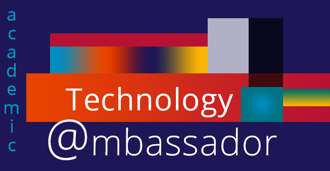
OK, so it’s hard to argue with simplicity, but that doesn’t mean you shouldn’t try sometimes! Especially when your in brainstorming mode. Inspired by a comic book I read recently I wanted to create something a little more abstract. Using some pretty straightforward shapes and applying gradients in PhotoShop I was able to get a look I’m very happy with. I don’t think it will quite work as a digital badge but I can definitely see variations of this working for website headers and presentations.

For the third and last concept, I wanted to try designing a logo. I recently got my hands on an iPad Pro with an Apple Pencil and have been experimenting a bit with digital drawing and inking – I’m still far from an artist but I’ve had a lot of fun playing around! I did a bit of research on symbolism and decided to try for a dove and olive branch to represent the ambassadors. Using Adobe Draw on the iPad I was able to sketch and refine over multiple layers of ink (OK, there may have been some tracing involved to get the basic shapes). Once I was happy with the sketch I was able to send it directly to PhotoShop CC to incorporate it into my design.
With the dove and olive branch representing diplomacy and peace I still needed to suggest technology – so I used a layer mask in PhotoShop to put a cut-out of the logo above colored bars to pay homage to an old logo of a certain obscure tech start-up – using colors straight out the UP brand book, of course. I’m really liking this badge as it combines some of the clean look of the first badge, the color of the second, and has some fun with symbol and color cues.

While I am still far from an accomplished designer I’ve learned a lot and had a lot of fun tackling graphics work in ATS. If you are in the UP community and interested in digital design I would really encourage you to take advantage of some of the resources you have here to learn more. You can login to Lynda.com through our Single Sign On or SSO portal – the Photoshop, Illustrator and Adobe mobile app courses there have really helped me get more out of the software. Also, the Clark Library Digital lab can be a great place to work on designs and get help with both software and aesthetic choices. Jose, the lab coordinator, puts on great workshops on various design and creative topics throughout the school term. And of course, keep a look out for digital design resources from ATS and our Virtual Learning Center digital courses.
I’m excited to share more of what the Academic Technology Ambassador program is all about soon – in the meantime thanks for checking out some of my doodles.