Educators use Microsoft Office to deliver a wide range of material — syllabi and other vital class documents in Word, slide decks in PowerPoint, and more. With Office 365 coming to campus, now is a great time for a reminder and refresher on the importance of creating documents that are accessible to a diverse audience. Creating documents in an accessible way can seem like a daunting task — but if you adopt a few simple habits, you’ll find that it will become second nature in no time. And trust me, when you get the satisfaction of knowing that a student with a sight, mobility, or learning disability has the chance to excel in your class because of a little bit of extra effort, it will definitely be worth it!
Luckily, Microsoft has always done a good job of embracing accessibility in their Office products. I attended an eLearning conference last winter and saw a great presentation on creating accessible Office docs. For the following guide, the examples will be from Word 2013 on PC. The tools are fairly consistent across Microsoft apps, and it’s pretty intuitive to make a PowerPoint accessible in much the same way you would a Word doc. In fact, the same principles can apply to creating a page in an LMS (Moodle) or on the web. All you have to remember is SPLAT!
SPLAT is an acronym that stands for the following:
- Styles and paragraphs
- Lists
- Alt text
- Tables
SPLAT in Word Video Overview
https://uportland.mediaspace.kaltura.com/id/0_z3d0yfto?width=705&height=443&playerId=28073962
Styles
Styles are used to semantically define text in Word. For example, that text is a title, quote, or heading. In longer documents, styles should be used to add headings and subheadings above your paragraph sections. This helps to visually and logically break up the content. It’s not sufficient to mark headings with large or bolded fonts. The outline created by style headings and subheadings is utilized by assistive devices such as screen readers to help users with disabilities navigate the document. It also helps sighted users understand and quickly find relevant parts of the document. It will even help you to better analyze and organize your document into a consistent and coherent whole.
How to Use Styles
On the Home tab, look for the Styles group. You’ll find options for various heading sizes, as well as normal paragraph text, titles, quotes, emphasis, and more. You can also choose styles from the Mini Toolbar (the little pop-up formatting bar that shows up when you select text). Either way, just highlight the text you want to apply a style to and click the corresponding style in the styles group.

You’ll want to use styles to structure your document. Heading 1 is the most important (think chapter titles or main content heading), then Heading 2 (main section headings), down to Heading 3 (sub-sections of a Heading 2), and so on. Lower degree headings should always be contained within headings of the next highest degree.
Using the Navigation Pane
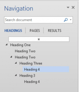
A helpful tool that can give you an overview of the structure of your headings is the Navigation Pane. You can reveal the Navigation Pane from the View tab on the Show group in Word 2013. You can easily see how each of your headings is nested to make sure your document is structured logically.

Pro tip: If you are consistent in applying styles, you can easily go to the Design tab and choose a new Style Set to instantly change the entire look and feel of your document. You can change fonts, colors, sizes, and more across your document with a single click. Make sure to choose a style set with a simple, clear font and plenty of contrast in the colors.

Lists
Lists help structure ordered content in a linear group. Lists are easy to navigate with the human eye and screen readers alike. In much the same way that headings structure a document, lists structure related items.
How to Use Lists
Put your cursor on text and choose a list format from the Paragraph group on the Home tab or from the Mini Toolbar.

You can apply a numbered list for items that belong in a specific order, a bullet list of unordered items, or even a multilevel list.
Protip: Lists are often easier to read and understand than a table. Consider using a bulleted list instead of a table for non-complex sets of like data.
Alt Text
Alt text is crucial to help screen readers access to any non-textual information. This includes images, charts or graphs, or SmartArt. When defining the alt attribute (alt text) on an image, context matters the most. Any relevant information that is conveyed with a picture or graphic should be understood by reading the alt text. I like to imagine that I need to describe the image or graphic to someone who I am reading the document to over the phone. They don’t need every detail; just the important information that the graphic is there to convey. If your graphic contains any relevant text, make sure to include it in the alt text. I do recommend avoiding images with embedded text whenever possible.
How to Add Alt Text
Add Alt Text to a Chart, Picture, SmartArt, or Shape

Next, in the Format Pane click Size & Properties (Layout & Properties in Word) and click Alt Text.
Make sure to add your alt text in the Description field. This is the field that will be read by a screen reader.
Protip: If the image is too complex to be adequately described in a few sentences, consider describing the image directly in the text of your document, using a caption, or providing a link to a longer form text description.
Tables
Tables can be very useful to summarize and organize data sets in documents. But, they also require some thought and care to ensure that they remain accessible.
How to Make Tables Accessible
The first thing to know about making tables accessible is knowing what not to do. Screen readers must be able to navigate a table in a way that makes sense to a user. They move through the table left to right, then top to bottom. You need to ensure that the reading order of your tables make sense and can be read left to right.
Reading Order
Consider the following table:
[su_table]
| Fruits | Veggies |
| Apples | Asparagus |
| Bananas | Kale |
| Oranges | Broccoli |
[/su_table]
A screen reader would read this table in the following order: fruits, veggies, apples, asparagus, bananas, kale, oranges, broccoli. This doesn’t make much sense. The contents of this table are actually related lists, and should formatted as such.
Now let’s look at a more appropriate use of a table:
[su_table]
| Name | Species | Weight | Age |
|---|---|---|---|
| Leia | Dog (terrier) | 15 lb | 7 |
| Scruffy | Dog (terrier) | 8 lb | 3 |
| Penny | Cat | 6 lb | 8 |
[/su_table]
Each row represents an entry with columns of data that can be read left to right.
In addition to using a left to right reading order, table structure needs to be kept relatively simple — extra complexity can throw off screen readers.
That means:
- Don’t split cells into multiple cells.
- Don’t merge cells across multiple rows or columns.
- Don’t nest tables.
Instead of splitting cells, it’s OK to list more than one item per cell. Instead of merging, you can repeat items in more than one row or column. You can adjust the row or column size to fit your cell data rather than altering the structure of a table.
Alt Tags
Just like images and charts, tables also require an alt tag. To add an alt tag, do the following:
- Right click on the table.
- From the context menu, choose Table Properties.
- In the table properties, click the Alt Text tab.
- Fill in a short title, and add alt text to the Description field.

Specifying a Header Row
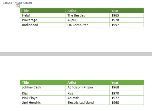
The final steps to making your table accessible have to do with configuring a header row. This should be the first row of your table, which provides contextual labels for each column of data. This will help screen readers communicate the meaning of each cell to the user. It ensures that the header row repeats if your table ends up being split across multiple pages.
To specify a header row, do the following:
- Click anywhere on your table.
- From the Table Tools – Design tab, in the Table Style Options group, ensure the Header Row checkbox is checked.

- Next, highlight the entire header row.
- From the Table Tools – Format tab, in the Data group, select Repeat Header Rows. Make sure the header row is highlighted during this step!

If you did this properly, your table row headers will repeat if your table spans across multiple pages.

Check Yourself
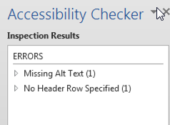
The Windows versions of Word has an accessibility check feature built in. This is a good way to check documents for potential accessibility issues with images, graphics, and tables. Just remember that the checker can’t assess the meaning of content; it’s up to you to format your document appropriately with headers and lists.
Note: The accessibility checker only works with .docx files.
To use the accessibility checker in MS Word 2010/2013/2016 for Windows, do the following:
- Go to the File tab.
- Select Info from the sidebar menu.
- Click on the Check for Issues button.
- Select Check Accessibility from the drop-down list.
The checker will provide a list of issues it finds, as well as provide information about why the issue effects accessibility and instructions for how to address the issue.
Summary
SPLAT isn’t the be-all and end-all of creating accessible Office documents. For example, any included links should be embedded into meaningful text, color choices should be high enough contrast to be easily visible, and font choices should lean toward easy legibility. But remembering the SPLAT fundamentals will go a long, long way to helping you create accessible Office documents!


3 thoughts on “MS Office and Accessibility”